About the paper:
Media summary as published at the Harvard Data Science Review
Vast amounts of data are increasingly used to make arguments about crisis topics such as climate change and global pandemics. Data visualizations are central to bringing these viewpoints to broader publics, where ‘narrative visualizations’ are used in popular science to inform, entertain, and persuade. At the same time, data visualizations conceal the many contexts involved in their production, ranging from decisions made in research labs about how to collect data to choices made in editorial rooms about which stories to tell. Revealing the contexts involved in producing data and visualizations is important to facilitate data understanding and reuse, counter misinformation, and increase transparency.
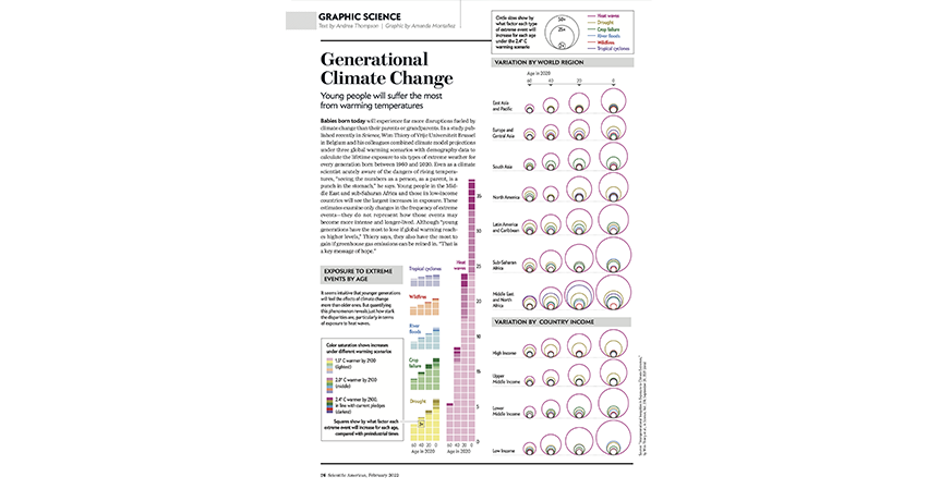
In this article, we apply the analytical concept of ‘data journeys’ (Leonelli, 2020) to examine how data visualizations about climate change and COVID-19 are produced in popular science magazines, using Scientific American, an established English-language popular science magazine, as a case study. We use the idea of data journeys to present the results of a mixed methods study centering on interviews with Scientific American staff, which is supplemented by a visualization analysis of selected charts. We also incorporate ‘visual vignettes’ into our analysis, which include example charts provided with permission from Scientific American.
Our findings highlight one set of practices for making data journeys visible and more transparent in popular science, while also critically exploring how data about climate change and COVID-19 are reused, visualized, and transported outside of academia to broader readerships. In particular, we highlight affordances of working with open data, the role of collaborative data practices, and how the magazine works to counter misinformation and increase transparency. Our work provides an empirical contribution by providing insight into the data (visualization) practices of science communicators and demonstrating how the concept of data journeys can be used as an analytical framework.
Gregory, K., Koesten, L., Schuster, R., Möller, T., & Davies, S. (2024). Data Journeys in Popular Science: Producing Climate Change and COVID-19 Data Visualizations at Scientific American . Harvard Data Science Review, 6(2). https://doi.org/10.1162/99608f92.141c99cf

